Showing posts with label NYC. Show all posts

Monday, February 21, 2011

Mentor Visit w/ Peter Rostovsky + Some Time in Chelsea (Part 1)

The former part of this post's title is the most important thing here, but I did the latter part first - so, for the sake of chronology….

As much as I wanted to attend Kamrooz Aram's show opening at Perry Rubenstein, I had to teach my landscape class at MECA that Friday until 4, so getting to Chelsea by 6 was clearly out of the question. I didn't make it to Long Island until 10:30 PM, actually.The next morning, I drove to Brooklyn and parked in front of Peter's studio. It's in a warehouse kind of building right on the edge of the BQE - fairly industrial, so the parking was easy on a Saturday. It was a short walk to the L train at Lorimer, so I hopped that to the end stop at 8th Ave & transferred to the C for 23rd. The wind out by 10th Ave was unreal. I had designs on walking the HighLine, but not in that gale.

Perry Rubenstein had just opened (10 AM) and I went in to see Kamrooz' work. I should mention here that he was a speaker in one of AIB's "Art Talks" at the last residency and I was not alone in feeling that it was a terrific explication of his work. As a result, I had a good line on the chronological evolution of his work, both visually and conceptually.  And the new work was superb: he definitely went up a level. The growth that he's achieved - so organic and fluid within his oeuvre - is certainly something from which any artist can learn. His Fana'  works are my personal favorites, so I've posted some here. Sorry about the lousy phone cam pics.

One of Kamrooz' "Fana'" paintings. Not sure of dimensions - around 50" x 40" 

Another "Fana'" piece. "Untitled #6," I think.

A detail of one of the "Flag" paintings. It's a good size overall, maybe 70" x 80"  or so.

I put my head down against the blast coming in off the Hudson and went around and up to 25th, stopping in at Henoch near the corner. Yes, I know: the usual suspects doing the usual things. Still, many of these people have amazing skills - some I couldn't even begin to touch. But, with such common and/or didactic concepts, well… it's a lot of pretty pictures is all I'm going to say about that.

Marlborough Chelsea is just a few doors up, so I walked into their huge space to find the large paintings of Juan Navarro Baldeweg, the show entitled, "Pintar, Pintar." Baldeweg is one of the foremost modern architects in Spain, so I was interested to see how he incorporated his love of spatial structure inside a flat plane of canvas. Now, I don't mean to sound flip, but I don't think I'm going out on a limb too far when I say that if Matisse were alive and an architect, his paintings would look like Baldeweg's. Even the prodigious use of red was apparent. And instead of print patterns, the patterning used here was derived from fencing, corrugated steel and other building materials. Should I dismiss his love of this very specific formalism? I don't know. Much of it was aesthetically pleasing, but it is definitely hard to get past his pastiche of Matisse's favorite formal moves.
Juan Navarro Baldeweg - "Pintor II" 2010, o/c 79" x 98" (approx.)

Next was a new gallery, though I had been in the space before: Axelle is now Bertrand Delacroix Gallery. Apparently, this is the same owner, but a different venture. And, strangely, I was approached by one of the gallery reps in exactly the same manner as I had when I'd last visited in the space's Axelle incarnation - that being, the young woman thought I was a dealer. I enjoy playing the part, and I suppose I look it in the way I study the works, but I dislike being disingenuous, even if it's harmless, so I excused myself to look at more work in the back. From a contemporary critical standpoint, the work was uneven, but I did think that much of Beth Carter's drawings were really fun and engaging, and Beate Bilkenroth's paintings were very strong. The latter works were of large utilitarian (modernist) apartments/condo-type buildings, and they really "moved" on the canvas. I'd seen the same subject dealt with in a representational fashion at Steven Zevitas' in Boston and it was not as strong as Bilkenroth.
Painting by Beate Bilkenroth in the window of BDG. Didn't get the title, sorry.

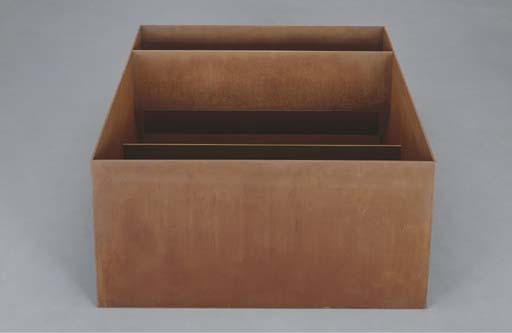
Last, but not at all least is Donald Judd at Pace. I have a strange affinity for this kind of "minimalism" (Judd hated that term), mostly because I appreciate the economy of form engendered in the work. I also enjoy it because, despite his best-laid intentions, I still can derive representation in those minimal forms. The piece, "Untitled" (1989, Cor-Ten steel) was my favorite in this grouping of wood, steel concrete and aluminum structures. It was just a big rectangular, rust-colored steel box on the floor with a thin beam inside the lower quarter and a thin, taller beam running along the top about a foot distant from the first one. At certain angles, this created a bi-level canyon-like effect which reminded me of natural forms in the Utah landscape; natural bridges and the like. Even the oxidized material underscored that relationship. I doubt very much that Judd would have agreed with me. But I wonder if his good friend Rackstraw Downes might…? Downes did spend a lot of time at Chinati. I'll bet there was a bit of this kind of discussion going on between them all the time - you know, non-signification versus representation and the like. Hopefully, Rackstraw might write about that one day.
Donald Judd - "Untitled" (1989) Cor-Ten steel.  39" x 78" x 78" (approx)

Anyway, I made my way across town to a Greek diner on 1st across from Stuyvesant Town. Good souvlaki and dolmades. The L is right there at 14th, so I could make the quick trip back to Brooklyn.

(cont'd in Part 2)

Monday, April 12, 2010

2010 NYC Spring Art Walk


(Above: [top] Bronzino Head Study, circa 1542, conte on paper.[bottom] Tauba Auerbach's "Untitled Fold Painting" 80"x60")


Friday morning, I ventured in from Pleasantville (Westchester area, where my wife's sister lives - I left my car at their place) on the Metro North. After dropping my gear at the pied-à-terre (which belongs to another of my wife's relatives), I hit Chelsea and 25th street at 11 AM. I hit Stux, Winston Wächter, Doosan, PaceWildenstein, Marlborough, Agora, Axelle and yes, Henoch. There was a great variety to behold, varying from the very traditional representational painting to digital lenticulars, video, sculpture, installation - the whole kit and caboodle. I'm pleased to say that I feel I've now somewhat of an ability to discern what works and does not work in most of these genres, be they representational or totally non-objective.


A pleasant surprise in the Chelsea visit was finding the Joseph Beuys exhibit, "Make the Secrets Productive," at PaceWildenstein. Talk about a total immersion in Beuys' work! There were video stations, installations and documentary photographs by Ute Klophaus of the "Aktionen" works. It goes without saying that my awareness of Fluxus art and Beuys had been summarily ignored by me (along with the rest of art after Modernism) until my introductions via Critical Theory 1. He is fascinating, I have to say. I had no idea about his work in Ireland. His efforts to draw greater attention to the Troubles, his delving into Celtic cultures and mythologies, and his efforts to establish a Free International University for Disciplinary Research in Dublin struck me as quite philanthropic (even though it was considered self-serving to some). I've written many papers on Irish History, having taken a course in the subject during my BFA, and it certainly drew me closer to my ancestry, so I suppose I have a soft spot for such things. I do also know how hard Beuys' work was taken to task at one point, with our old pal Buchloh in the vanguard. It's good to know that the vitriol has dissolved somewhat in the light of current revisionist critique.


An unpleasant surprise was the incredibly bad painting at Agora Gallery. Coincidentally, it was a sampler of contemporary German art, most of which was painting. About 75% of it could have been considered representational, but almost all of that bit was damn awful. There were a handful of abstracted works, and I enjoyed them much more (but not that much). Perhaps I was missing something? Were these paintings purposely done in a postmodern deskilled mode? With some, I suppose the naive, folky quality might suggest that notion, but the rest. oh lordy, did they suck. Peter Martin's giant acrylic succubi could have been painted by one of my second-year illustration students, and if it had been, I would have given him shit for such half-assed technique and Hot Topic-oriented subject matter. I should have been tipped off by the prices - they weren't NYC-level. The most expensive stuff topped out at 8K, and it ranged all the way down to 300 bucks for a 12 x 16 piece.


So I went up towards the Whitney after some of NYC's finest cuisine in the form of a couple of slices from Aviano's on 9th. I got on the C, and instead of transferring to the E to get across town at 50th, I stayed on 'til 72nd and the Park on the West Side. It was such a beautiful day that I felt compelled to walk through the park. I've missed doing that, so it was a lovely interlude.


The Whitney Biennial was - as I've been told, the usual case - uneven. There definitely were some very good pieces, some of which may have been better served in a different setting, but solid nonetheless. Nothing struck me as "bad" or even derivative - but I was indifferent to not a few things.


Two high points:
1 - Tauba Auerbach's "fake" trompe l'oeil paintings were just great: they sure fooled my eyes. They are huge canvases with big folds in them, and they look, from a normal viewing distance, like Claudio Bravo's straight-on trompe loeils of packages and cloth. At first, I wondered why someone similar to Bravo was in the Biennial; that sort of work doesn't reflect the current tack of the contemporary. Then, I got close to the work. The artist actually folds the canvas into a particular pattern, unfolds it, then spray-paints it with an automotive painting wand parallel to the surface so that one side of the folds pick up the most paint, creating a faux drop shadow. If you look at the topography of the piece from the side, you see the structures of the folds. It's simple and smartly executed.
2 - I timed my visit so I wouldn't miss a performance piece, "Strange Attractors," by Aki Sasamoto. It was very meandering and physical (she stuffed herself into a cardboard tube at one point), but humorous and contemplative at the same time. I won't describe her actions and words verbatim, but I will say that I did understand it after I thought about it post-performance. It turns out it was a highly personal piece that ultimately showed the artist's growth and discovery of her mature, artistic self through a personal "math" of disjointed code involving donuts, hemorrhoids, psychics, dreams of strawberries, the express "A" train, and other fun things.


From there I hit the Bronzino drawings at the Met, which were fantastic. After all the contemporary stuff I'd seen, I felt I needed a bit of "comfort food," you know? After those amazing pieces of history, I wandered way into the back where the Church and Bierstadts hang, just to sit and bask for a time. From there I tried to take in the Limbourg Brothers illuminated manuscripts. but good lord, was I tired. They were just too much for me at that point. I had started at 11 AM and it was now 6:30. All I wanted to look at was a big ol' pint of some heavy cask ale. I headed back to the East Side to York and 74th where you'll find David Copperfields. The taps are clean and highly varied. Victory's "Hop Devil" was on cask, and well, I claimed a Victory for myself!