The former part of this post's title is the most important thing here, but I did the latter part first - so, for the sake of chronology….
As much as I wanted to attend Kamrooz Aram's show opening at Perry Rubenstein, I had to teach my landscape class at MECA that Friday until 4, so getting to Chelsea by 6 was clearly out of the question. I didn't make it to Long Island until 10:30 PM, actually.The next morning, I drove to Brooklyn and parked in front of Peter's studio. It's in a warehouse kind of building right on the edge of the BQE - fairly industrial, so the parking was easy on a Saturday. It was a short walk to the L train at Lorimer, so I hopped that to the end stop at 8th Ave & transferred to the C for 23rd. The wind out by 10th Ave was unreal. I had designs on walking the HighLine, but not in that gale.
Perry Rubenstein had just opened (10 AM) and I went in to see Kamrooz' work. I should mention here that he was a speaker in one of AIB's "Art Talks" at the last residency and I was not alone in feeling that it was a terrific explication of his work. As a result, I had a good line on the chronological evolution of his work, both visually and conceptually. And the new work was superb: he definitely went up a level. The growth that he's achieved - so organic and fluid within his oeuvre - is certainly something from which any artist can learn. His Fana' works are my personal favorites, so I've posted some here. Sorry about the lousy phone cam pics.
 |
| One of Kamrooz' "Fana'" paintings. Not sure of dimensions - around 50" x 40" |
 |
| Another "Fana'" piece. "Untitled #6," I think. |
 |
| A detail of one of the "Flag" paintings. It's a good size overall, maybe 70" x 80" or so. |
I put my head down against the blast coming in off the Hudson and went around and up to 25th, stopping in at Henoch near the corner. Yes, I know: the usual suspects doing the usual things. Still, many of these people have amazing skills - some I couldn't even begin to touch. But, with such common and/or didactic concepts, well… it's a lot of pretty pictures is all I'm going to say about that.
Marlborough Chelsea is just a few doors up, so I walked into their huge space to find the large paintings of Juan Navarro Baldeweg, the show entitled, "Pintar, Pintar." Baldeweg is one of the foremost modern architects in Spain, so I was interested to see how he incorporated his love of spatial structure inside a flat plane of canvas. Now, I don't mean to sound flip, but I don't think I'm going out on a limb too far when I say that if Matisse were alive and an architect, his paintings would look like Baldeweg's. Even the prodigious use of red was apparent. And instead of print patterns, the patterning used here was derived from fencing, corrugated steel and other building materials. Should I dismiss his love of this very specific formalism? I don't know. Much of it was aesthetically pleasing, but it is definitely hard to get past his pastiche of Matisse's favorite formal moves.
 |
| Juan Navarro Baldeweg - "Pintor II" 2010, o/c 79" x 98" (approx.) |
Next was a new gallery, though I had been in the space before: Axelle is now Bertrand Delacroix Gallery. Apparently, this is the same owner, but a different venture. And, strangely, I was approached by one of the gallery reps in exactly the same manner as I had when I'd last visited in the space's Axelle incarnation - that being, the young woman thought I was a dealer. I enjoy playing the part, and I suppose I look it in the way I study the works, but I dislike being disingenuous, even if it's harmless, so I excused myself to look at more work in the back. From a contemporary critical standpoint, the work was uneven, but I did think that much of Beth Carter's drawings were really fun and engaging, and Beate Bilkenroth's paintings were very strong. The latter works were of large utilitarian (modernist) apartments/condo-type buildings, and they really "moved" on the canvas. I'd seen the same subject dealt with in a representational fashion at Steven Zevitas' in Boston and it was not as strong as Bilkenroth.
 |
| Painting by Beate Bilkenroth in the window of BDG. Didn't get the title, sorry. |
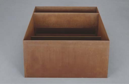
Last, but not at all least is Donald Judd at Pace. I have a strange affinity for this kind of "minimalism" (Judd hated that term), mostly because I appreciate the economy of form engendered in the work. I also enjoy it because, despite his best-laid intentions, I still can derive representation in those minimal forms. The piece, "Untitled" (1989, Cor-Ten steel) was my favorite in this grouping of wood, steel concrete and aluminum structures. It was just a big rectangular, rust-colored steel box on the floor with a thin beam inside the lower quarter and a thin, taller beam running along the top about a foot distant from the first one. At certain angles, this created a bi-level canyon-like effect which reminded me of natural forms in the Utah landscape; natural bridges and the like. Even the oxidized material underscored that relationship. I doubt very much that Judd would have agreed with me. But I wonder if his good friend Rackstraw Downes might…? Downes did spend a lot of time at Chinati. I'll bet there was a bit of this kind of discussion going on between them all the time - you know, non-signification versus representation and the like. Hopefully, Rackstraw might write about that one day.
 |
| Donald Judd - "Untitled" (1989) Cor-Ten steel. 39" x 78" x 78" (approx) |
Anyway, I made my way across town to a Greek diner on 1st across from Stuyvesant Town. Good souvlaki and dolmades. The L is right there at 14th, so I could make the quick trip back to Brooklyn.
(cont'd in Part 2)


No comments :
Post a Comment